Improving the platform experience for SolarWinds users
A platform modernization focused on navigation clarity, scalable templates, and a durable design system.
About Slide UX
Slide UX is a boutique user experience consultancy that helps companies create more usable, engaging digital products. For this project, we partnered with SolarWinds, a leader in IT management solutions, to redesign their digital platform and build a new design system to modernize the user experience across devices.
Scope
SolarWinds needed a major upgrade to its digital platform. Our mission was to redesign their navigation, modernize key product pages, and establish a scalable design system that worked seamlessly across desktop, tablet, and mobile experiences. Our approach was grounded in an extensive UX audit, competitive research, user journey mapping, audience research, and collaboration with marketing and product teams.
The Team
- Stakeholders: SolarWinds and Slide UX product managers and marketing leads.
- Contributors: Slide UX designers, researchers, and developers.
- End Users: IT professionals, network administrators, and enterprise clients.
My Role
At Slide UX, I worked alongside a product manager and another designer. I led the redesign of the navigation menus, collaborated on wireframes and layouts for key pages, and contributed to strategic alignment and research synthesis. I also helped shape the design system and mobile experience, working closely with the SolarWinds marketing team through regular feedback sessions.
Strategic Alignment: Defining the SolarWinds Story
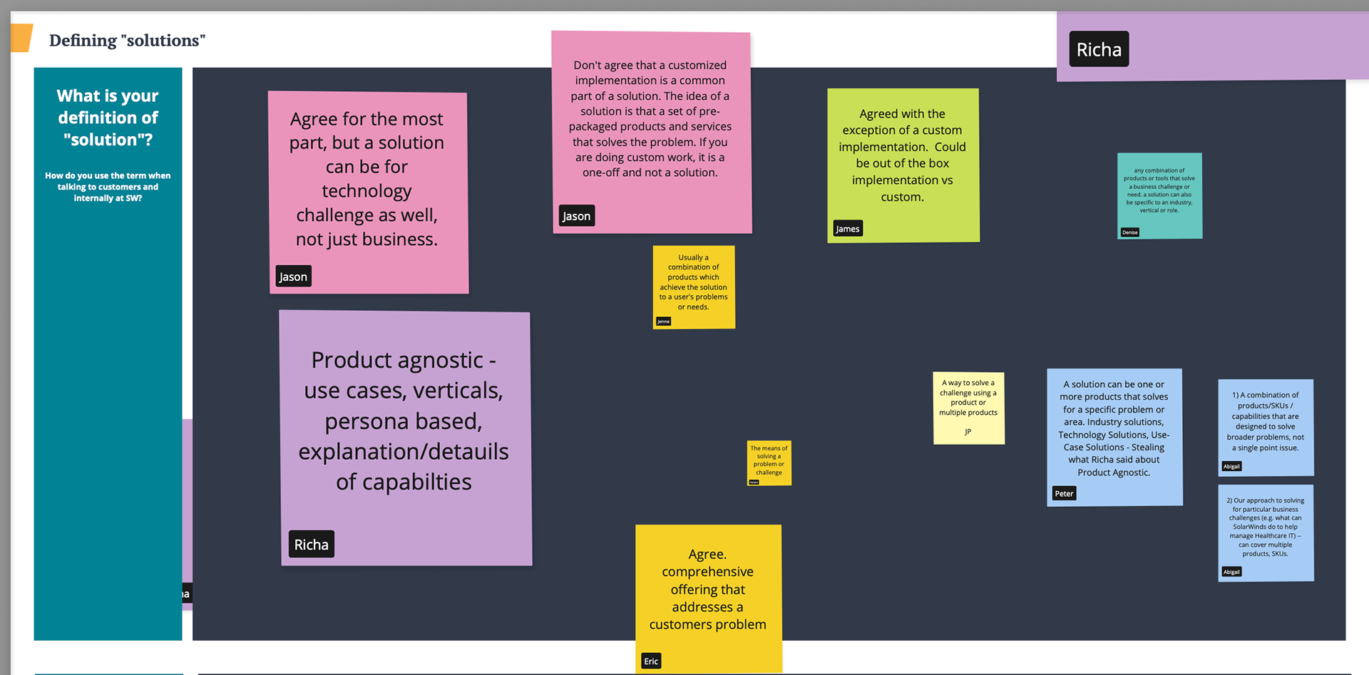
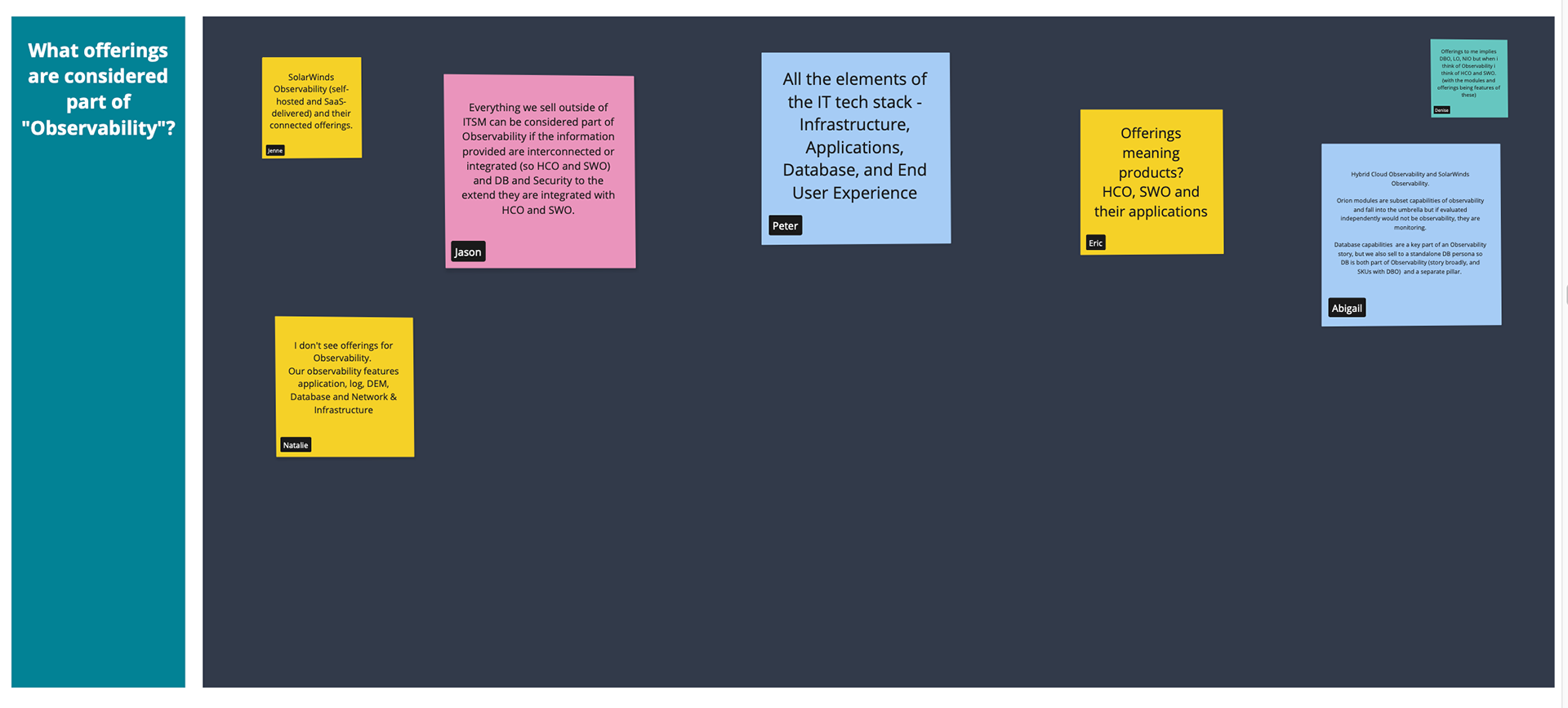
As part of our engagement, Slide UX led a strategic alignment workshop with SolarWinds leadership, marketing, and product teams.
The goal was to define clear, shared language around "Products," "Solutions," "Platform," and "Observability" terms that had previously been used inconsistently across teams.
Through guided exercises and discussions, we surfaced misalignments and established common definitions.
These workshops directly influenced:
- How products and solutions were organized in navigation.
- How storytelling was shaped across homepage, product, and solution pages.
- How CTAs and user flows reinforced unified messaging.
Aligning internal terminology helped future-proof SolarWinds' external communications and simplified the user experience by making the platform and its offerings easier to understand.
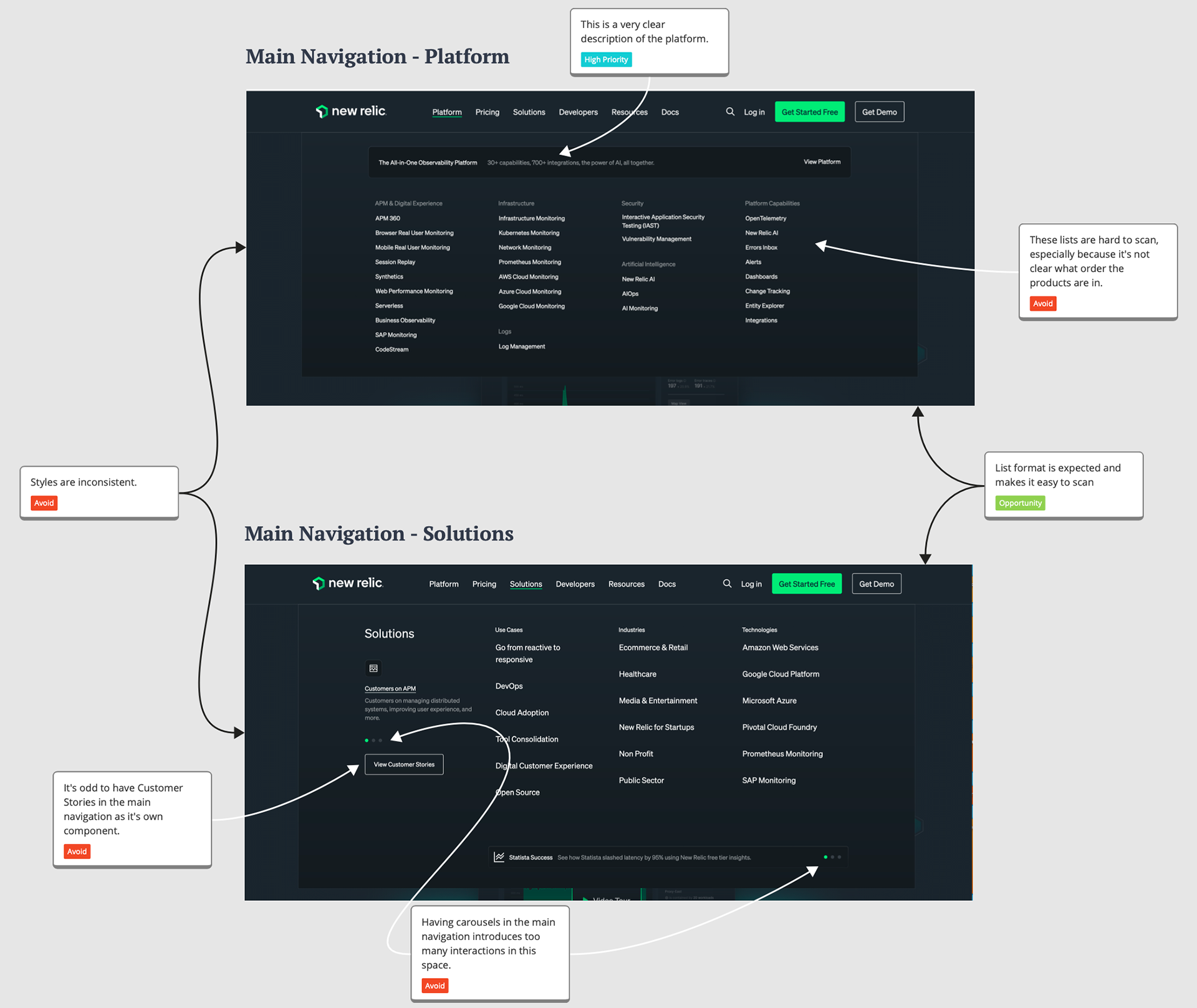
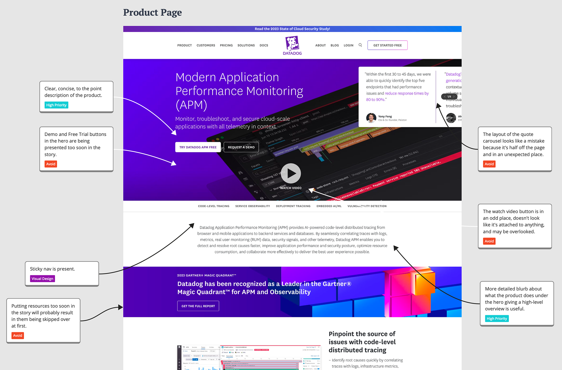
Competitive Research & Strategy
Analyzed industry-leading competitors to benchmark against best practices and common pitfalls. Identified opportunities like sticky navigation, ungated demos, strategic CTA placements, better security messaging, and storytelling through animated screenshots. Used these findings to refine SolarWinds' future navigation, visual design language, and content architecture.
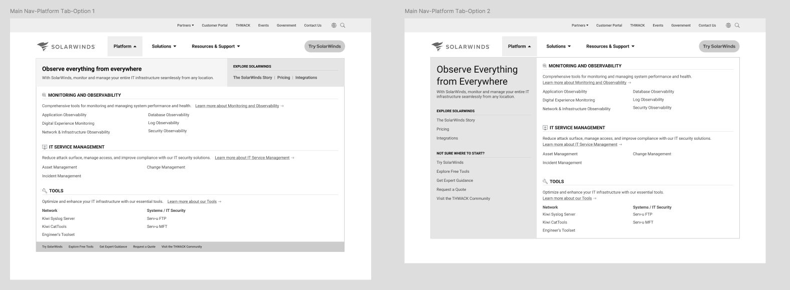
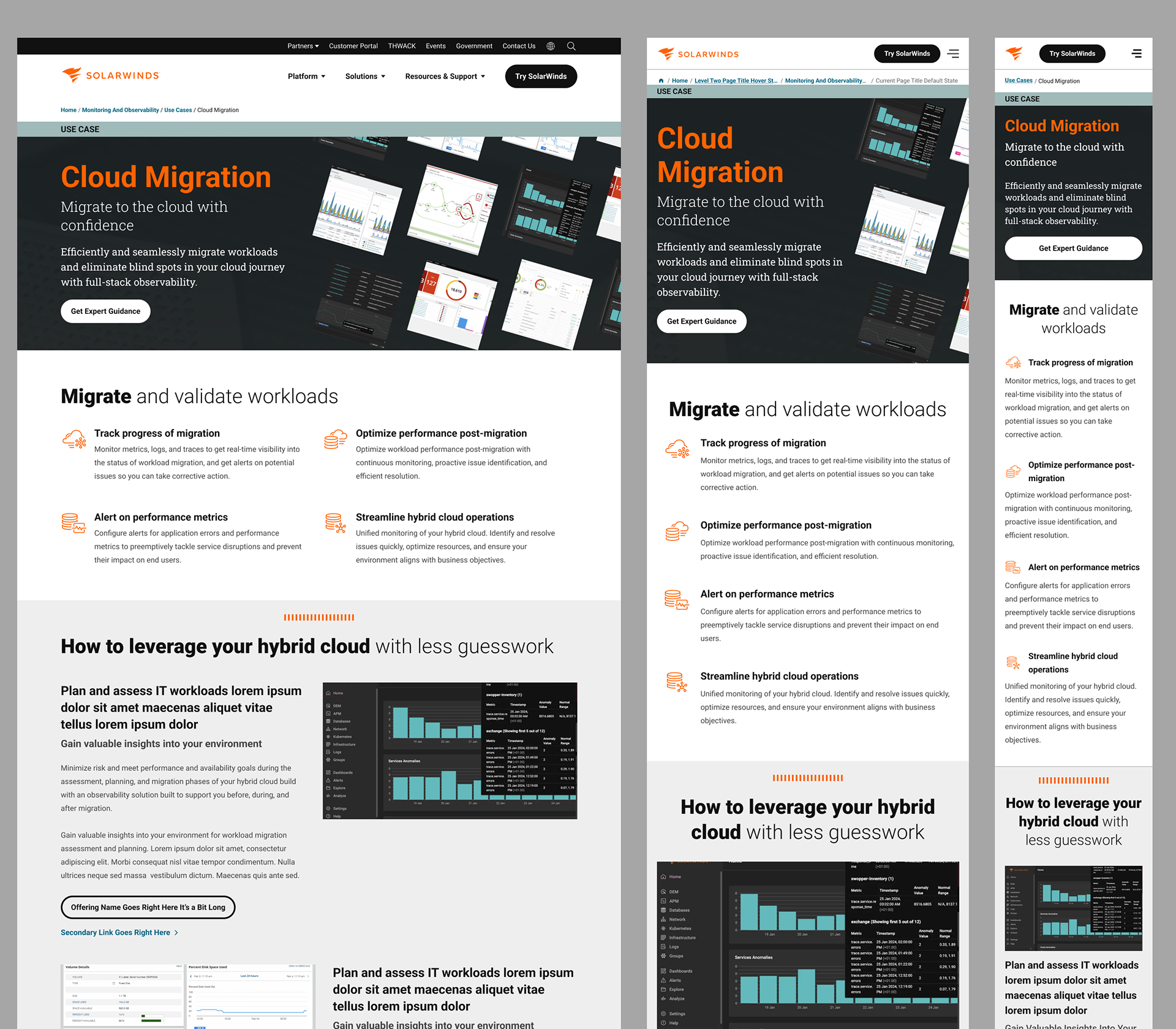
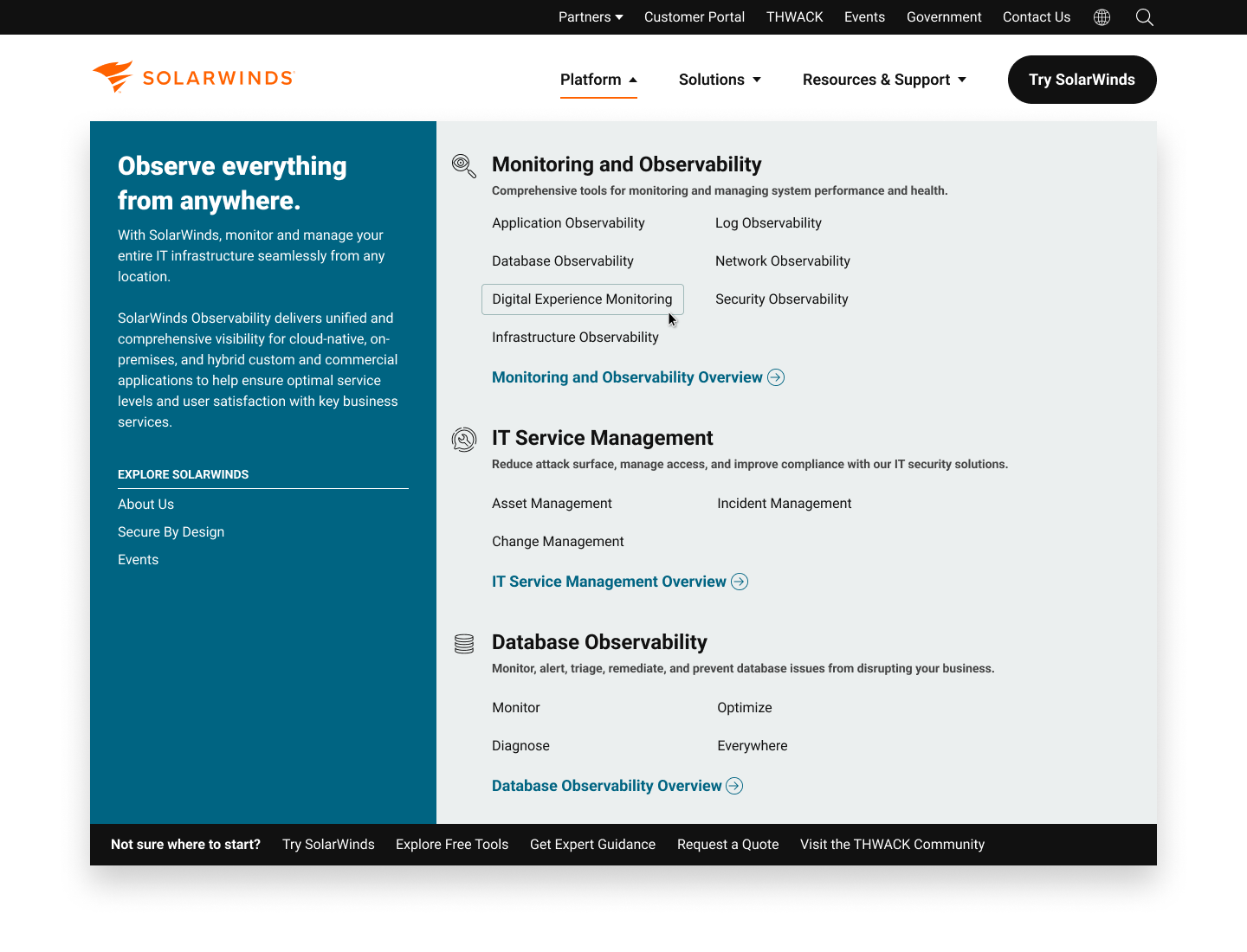
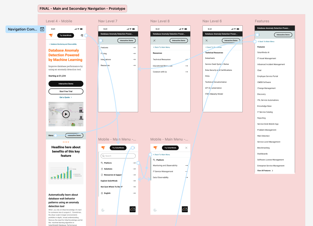
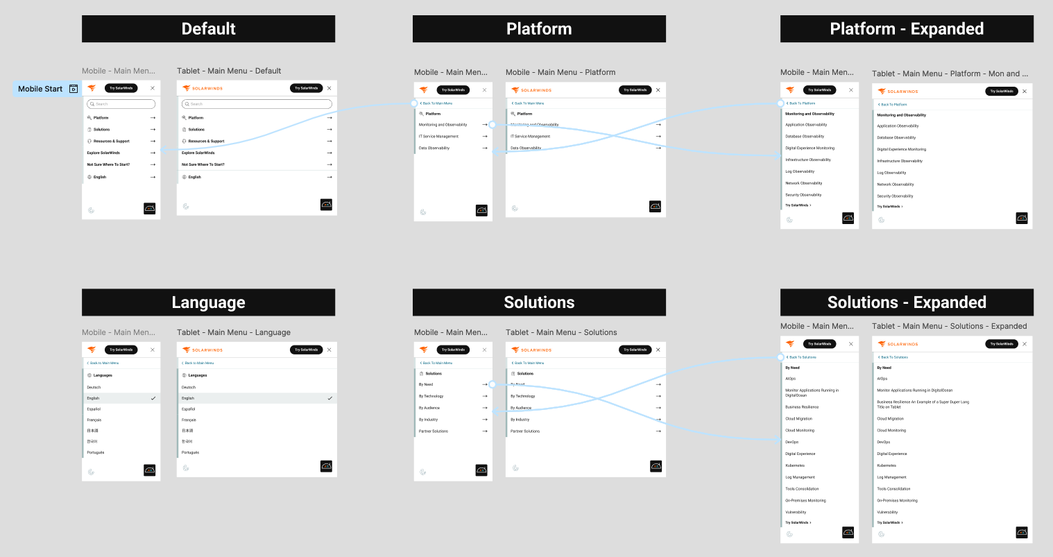
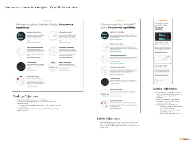
Wireframes, Navigation, & Collaboration
Partnered with the SolarWinds team to create and iterate on wireframes for the Homepage, Level 2-4 pages, and use case-driven flows. Proposed a capability-first navigation structure to replace brand-name confusion, directly addressing findings from user interviews and competitor analysis. Mapped user journeys based on key actions like finding a new solution, verifying company credibility, and switching products.
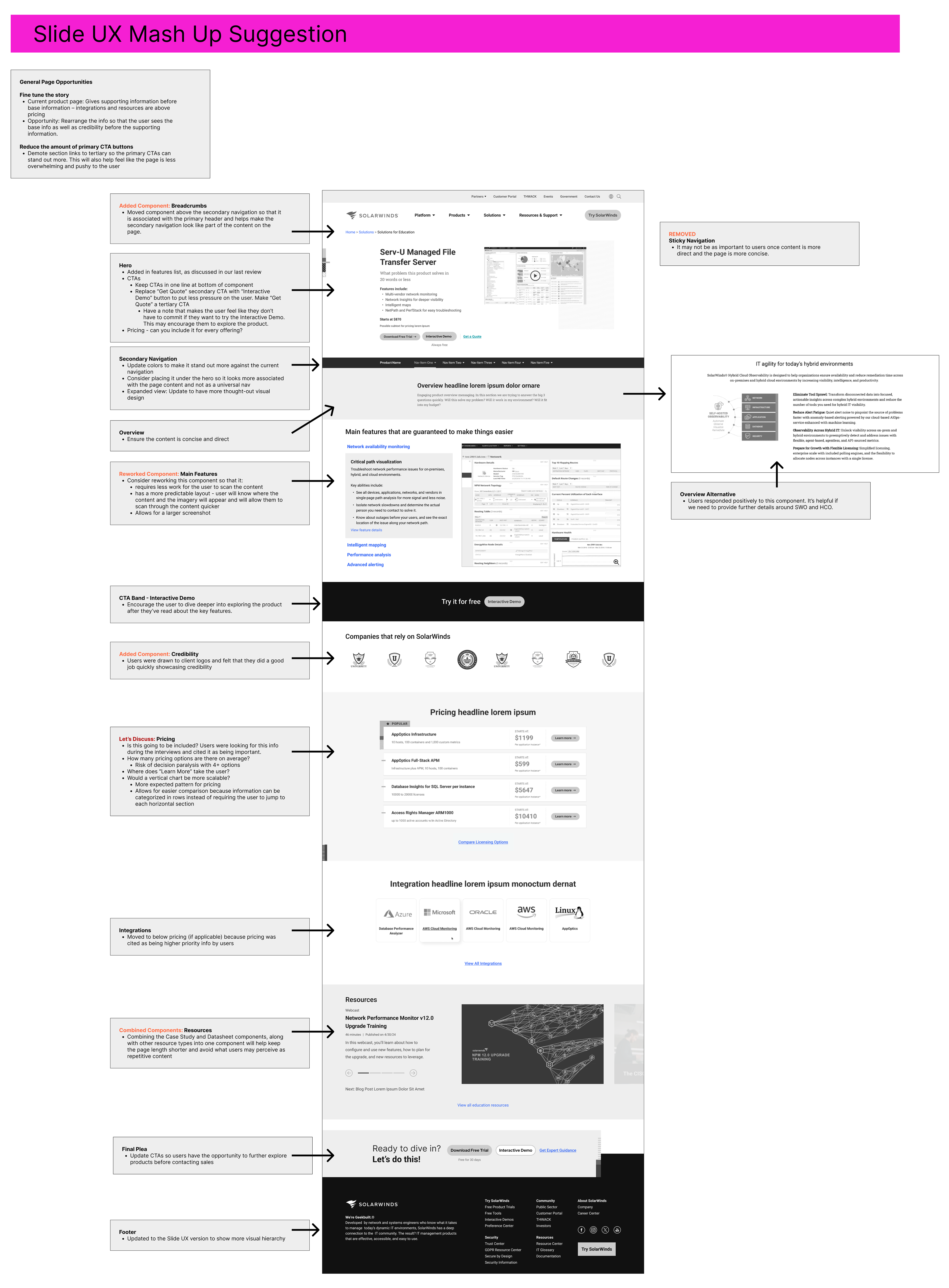
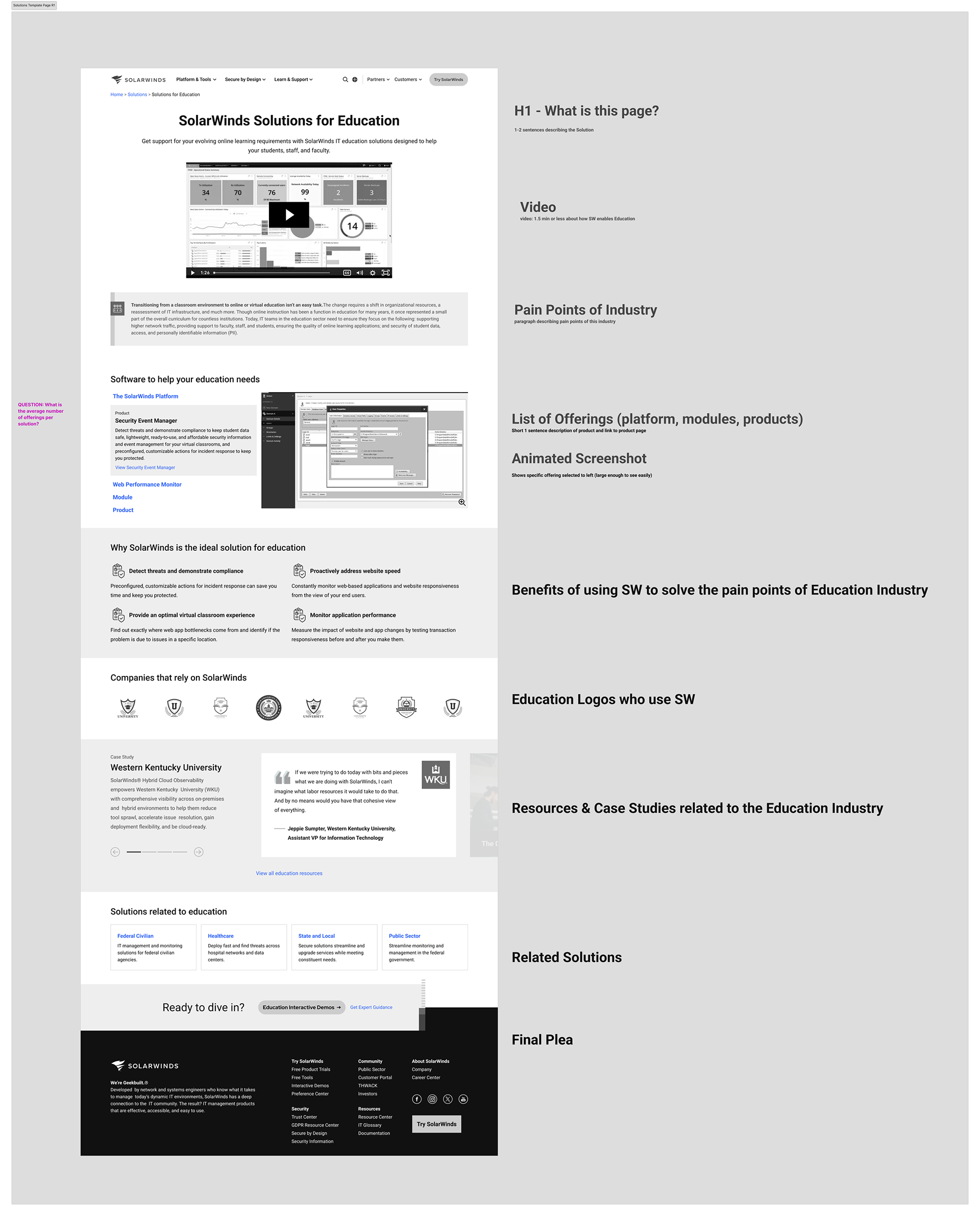
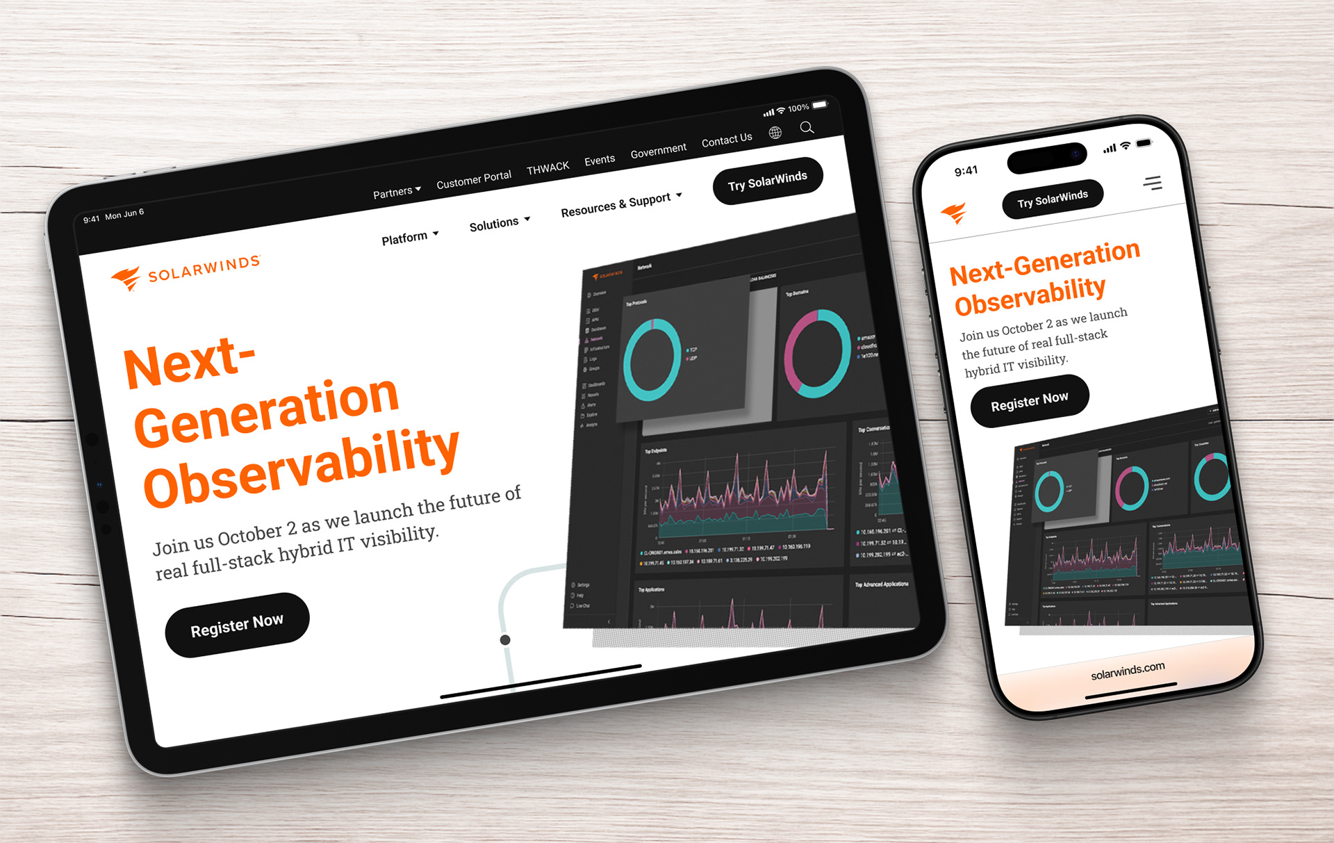
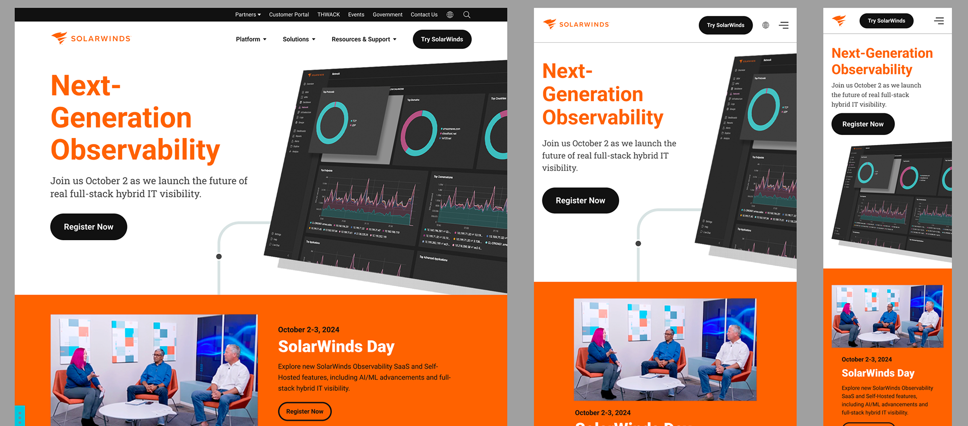
High-Fidelity Mockups & Navigation Improvements
Delivered polished high-fidelity designs for homepage, product listings, solutions pages, and mobile-first templates. Aligned navigation structures and storytelling flows with best practices observed during competitor deep dives (New Relic, Dynatrace, Datadog, LogicMonitor). Prioritized clear CTAs placed later in the flow, strong credibility content early, and user-friendly page hierarchy.
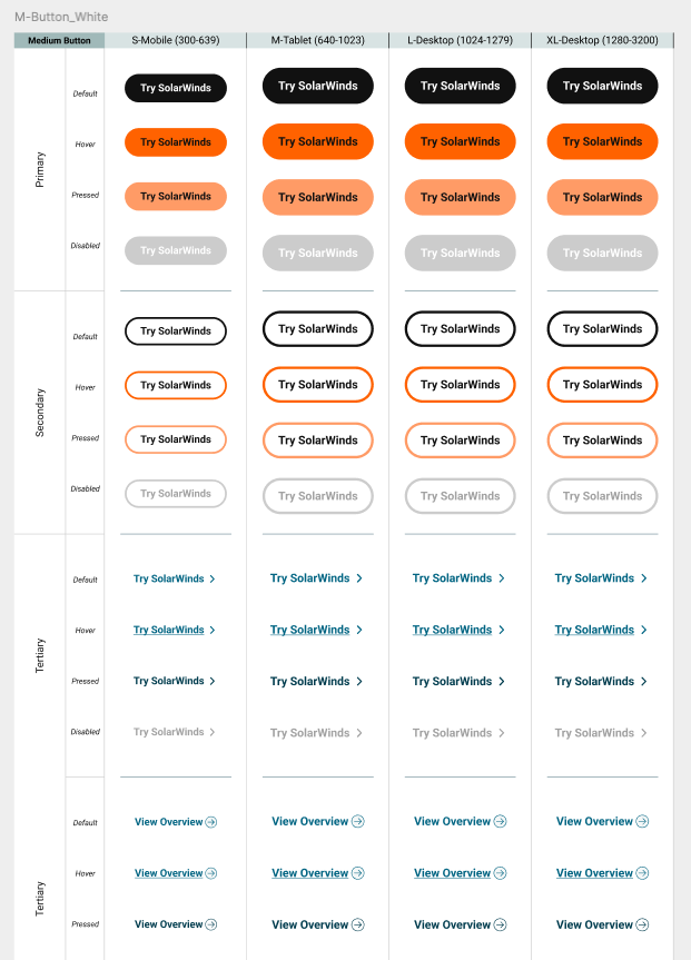
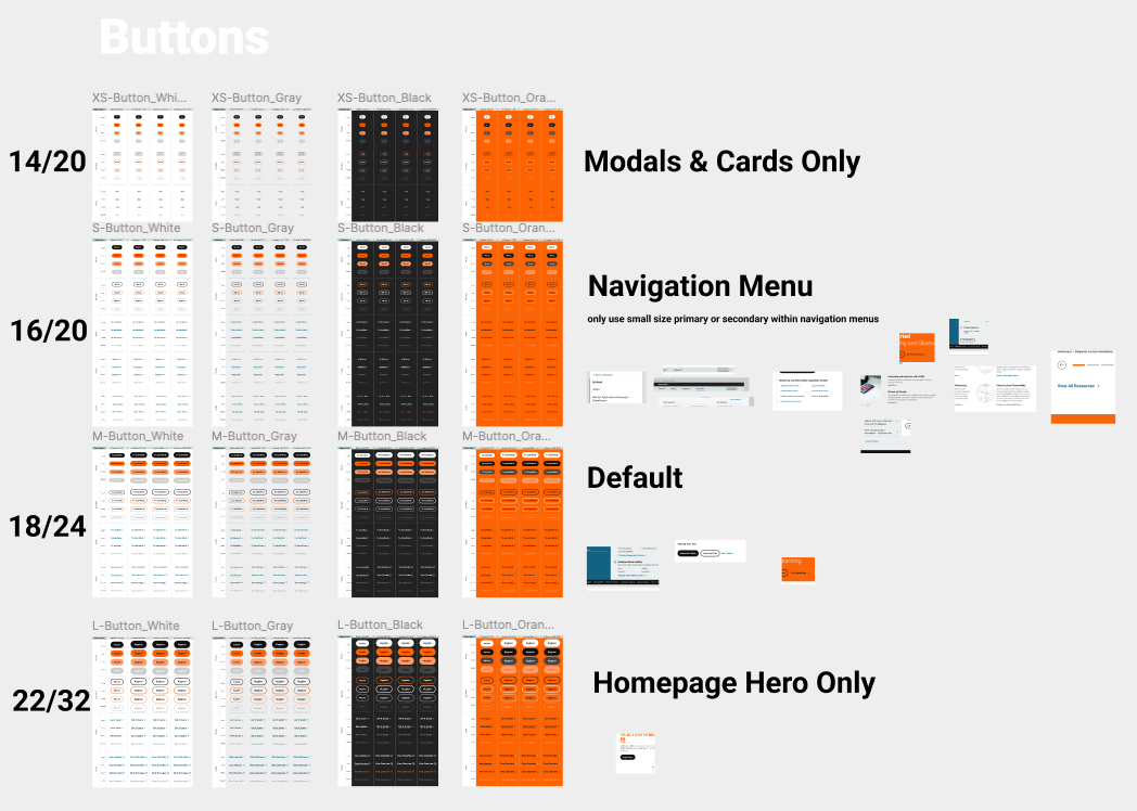
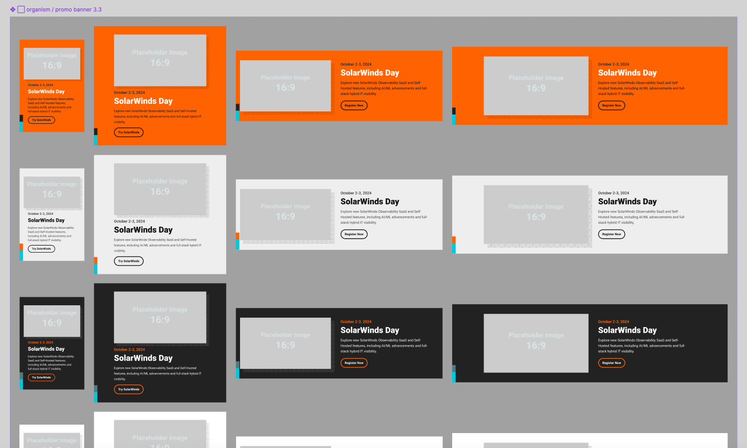
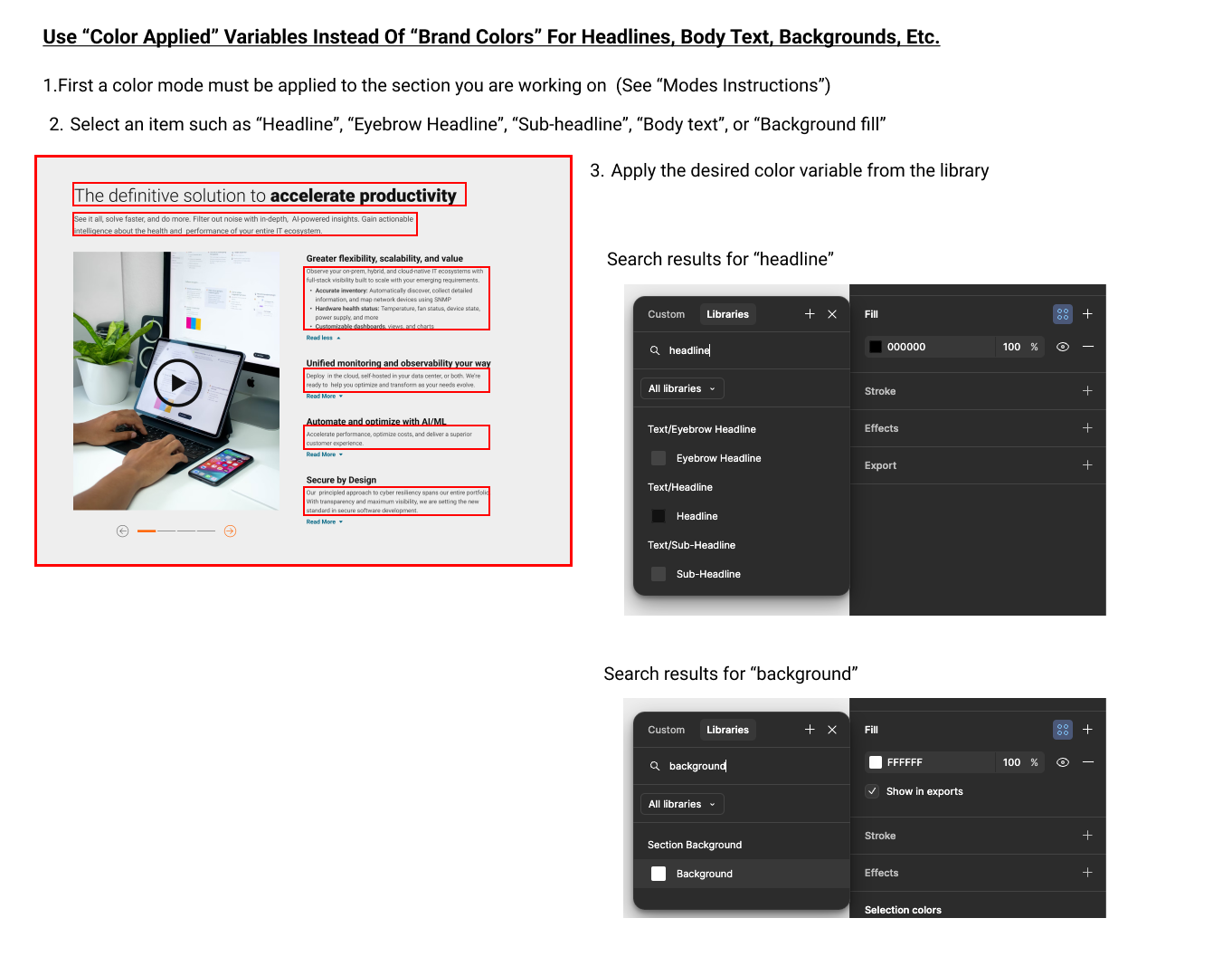
Design System
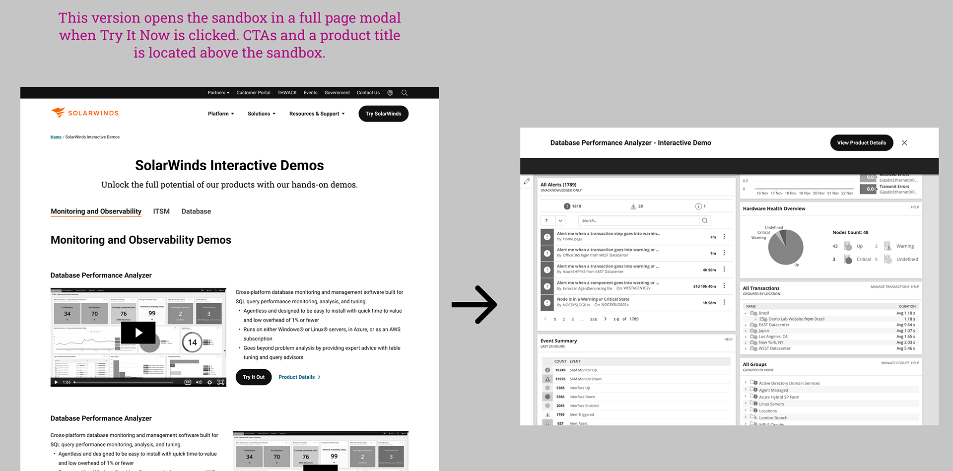
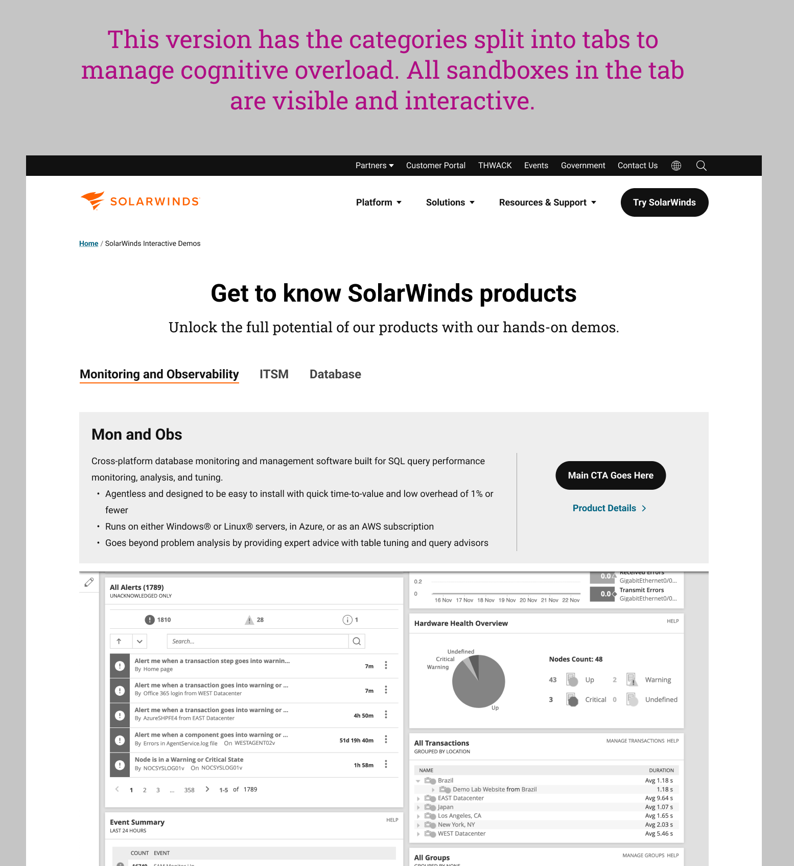
Built a scalable design system supporting 8 languages and multiple SolarWinds properties. Standardized UI elements across templates to create consistency and accelerate future development. Refined visual storytelling with better use of screenshots, animations, and interactive demos, inspired by competitor best practices.
Developer Handoff
Delivered annotated Figma files organized around templates, component libraries, and mobile adaptations. Provided clear specifications to ensure smooth development and future-proof scalability.
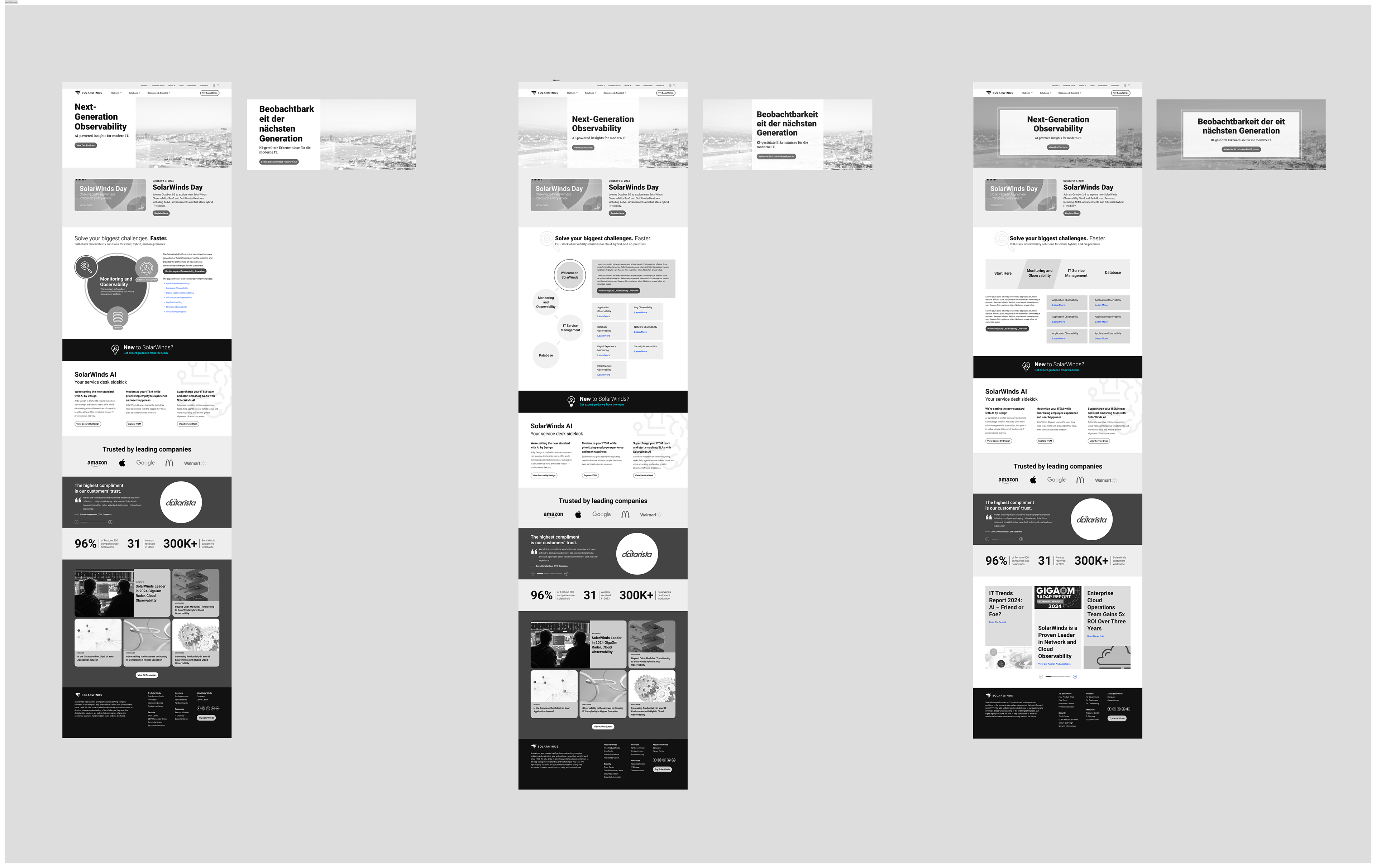
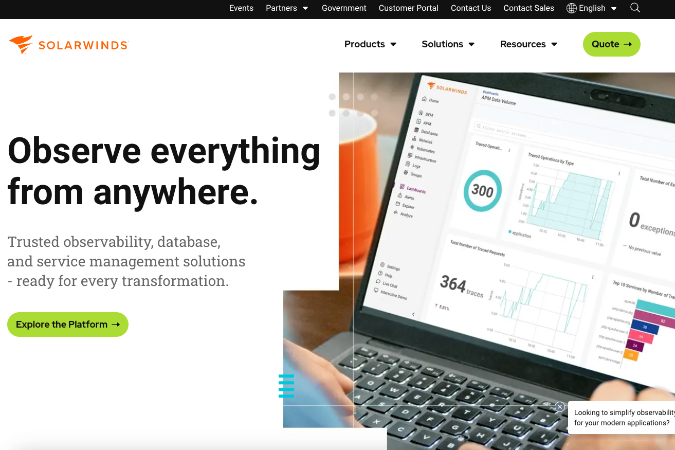
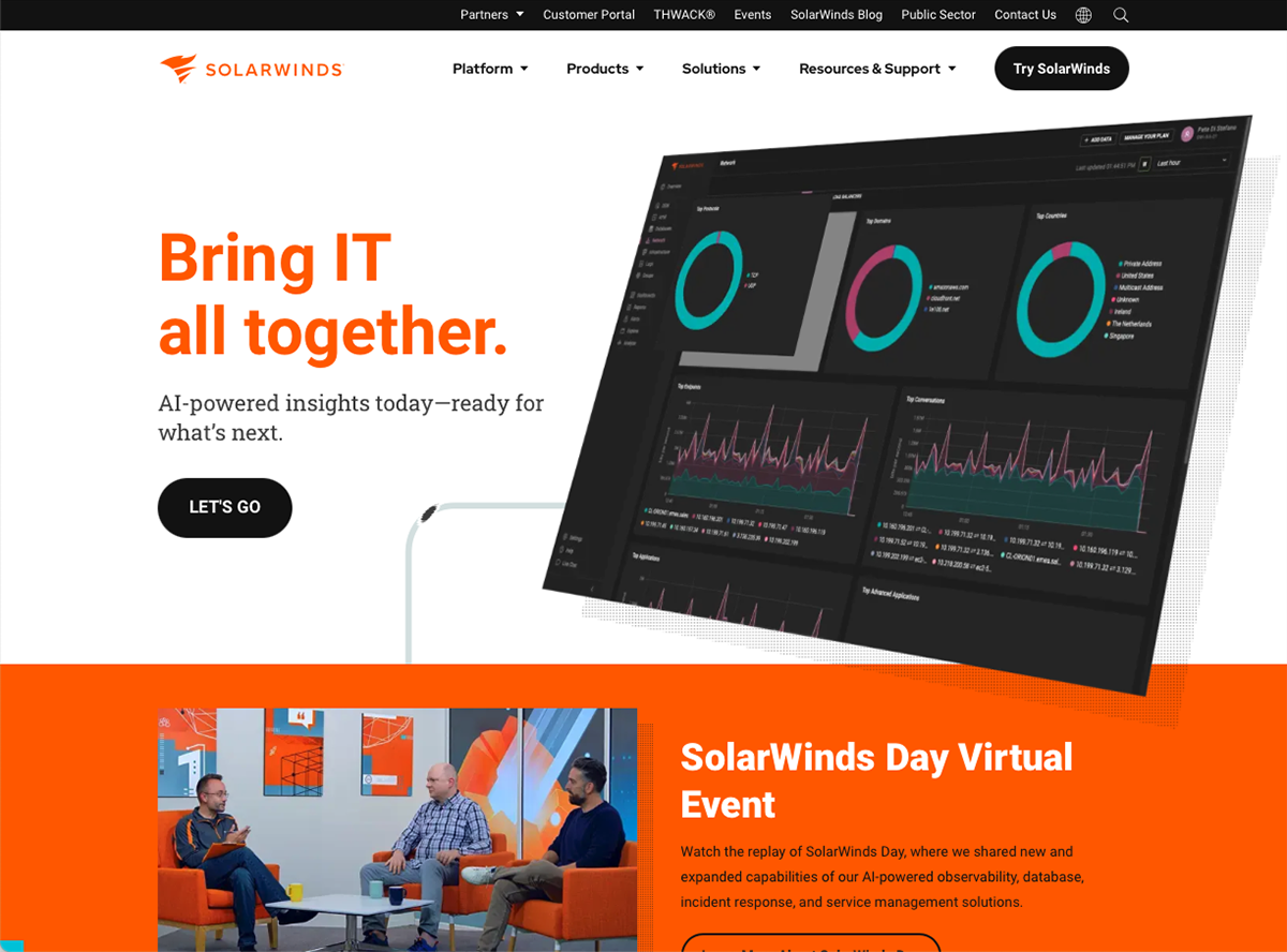
Before & After
What Improved:
- Switched to a capability-first structure with clearer product organization.
- Emphasized demos, credibility signals, and real user needs throughout templates.
- Built scalable systems that support localization across 8 languages.
- Reimagined mobile layouts based on best practices and research findings.
- Closed gaps against leading competitors while leaning into SolarWinds' unique strengths.
Key Highlights
Our navigation redesign and user flow mapping were rooted in detailed audience and competitor research. We aligned storytelling, layout, and interaction patterns with both user needs and SolarWinds’ business goals. The new sitemap and templates future-proof SolarWinds' platform to adapt and grow easily over time.
This project showed the power of combining UX audits, competitive research, user interviews, and collaborative iteration. By deeply understanding user needs, analyzing market gaps, and working hand-in-hand with stakeholders, we helped SolarWinds create a platform experience that is modern, intuitive, and built to evolve.