Improving IT Workflows with Better Monitoring
A redesign of the Endpoint Smartboard to reduce cognitive load and help IT teams identify issues faster.
About Catchpoint
Catchpoint Systems is a digital experience monitoring company that helps enterprises optimize performance across complex networks and applications. Their platform supports proactive performance management for globally distributed teams.
Design Challenge
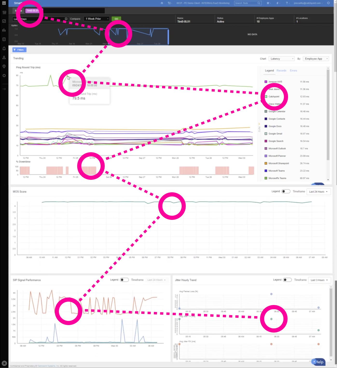
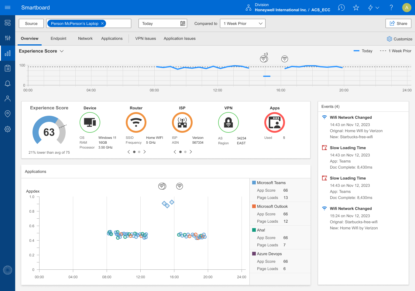
IT teams relied on the Endpoint Smartboard to troubleshoot remote network issues, but the original version stacked chart after chart into one long, scrolling page and lacked clarity. Our challenge was to redesign the experience so users could quickly correlate key metrics and identify root causes, without frustration or guesswork.
Users
- IT Administrators managing remote workforce performance
- Network Support Engineers conducting endpoint diagnostics
My Role
- Product Designer
- UX Researcher
- Design Systems Contributor
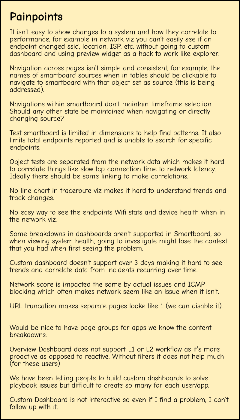
User Research & Findings
To deeply understand the challenges users faced, I conducted a series of interviews and usability tests with IT administrators and customer support teams. These insights formed the foundation of the redesign.

- Complex navigation: Users had to move through multiple charts to access key information, slowing workflows.
- Lack of customization: Users wanted role-based dashboards that prioritized the metrics they needed most.
- Inconsistent visual design: Varying UI patterns created a disjointed experience for both new and experienced users.

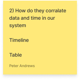
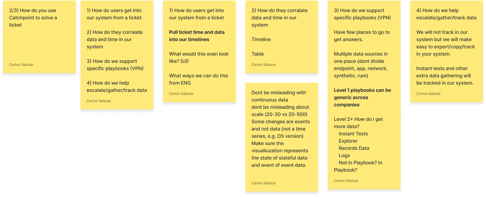
Workshop
Stickies and notes created during an Ideation Workshop, where ideas to simplify the smartboard took shape.
Ideation
- Wireframes: Developed low-fidelity wireframes to map user flows and iterate quickly.
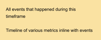
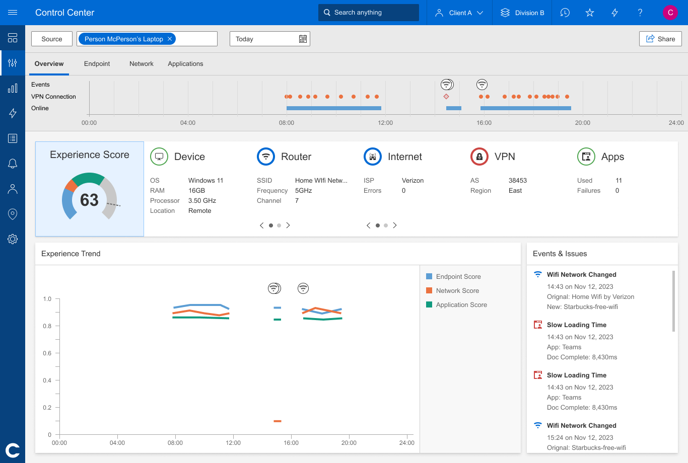
- Mockups: Some early concepts of the Endpoint Smartboard.
Deliverables
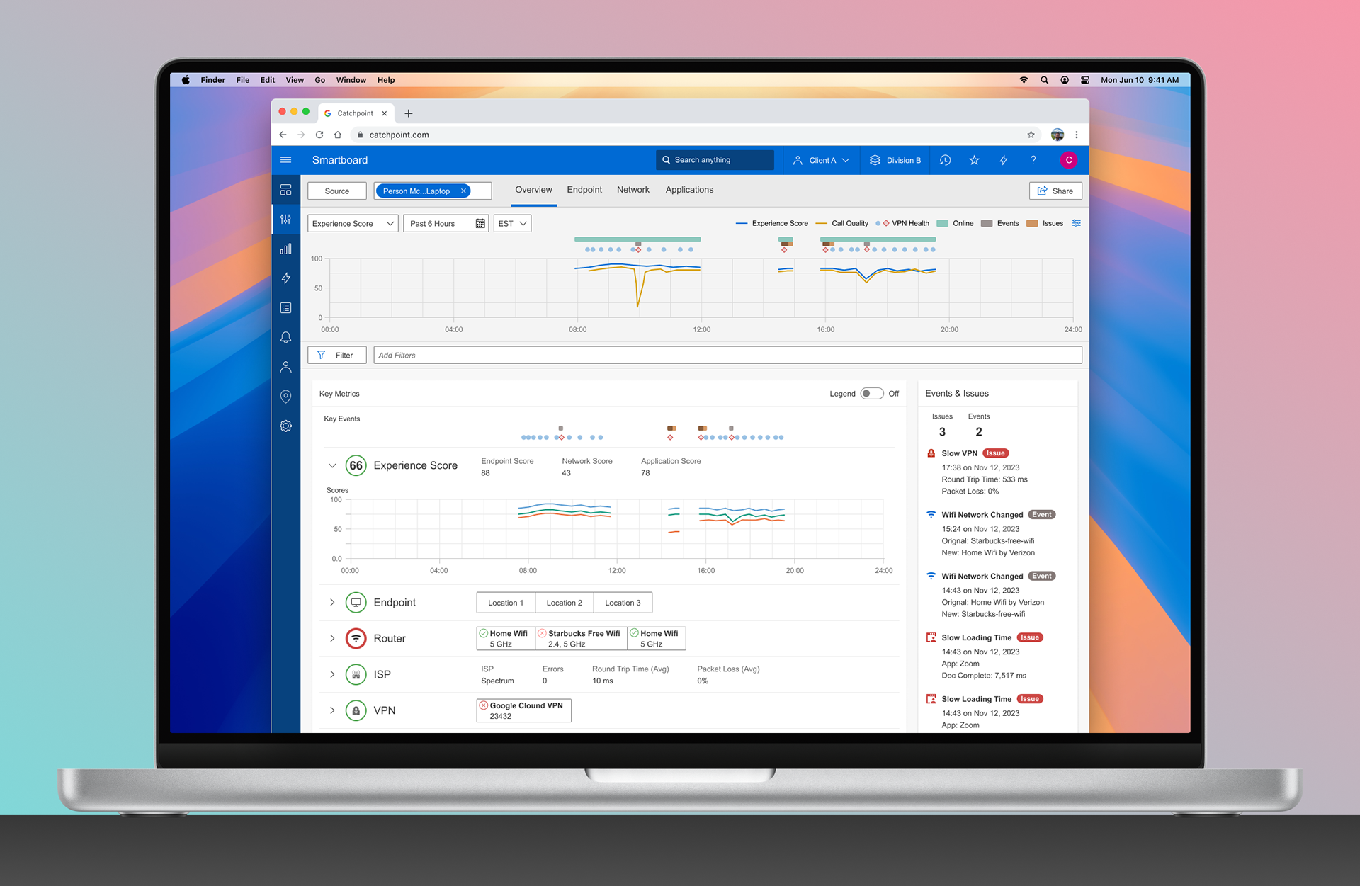
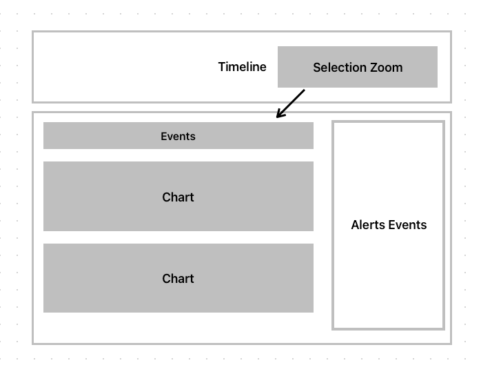
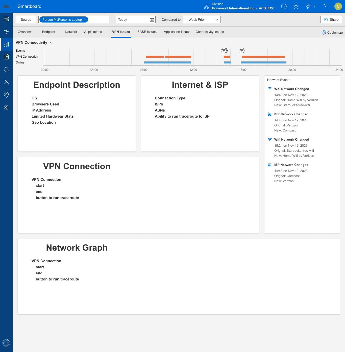
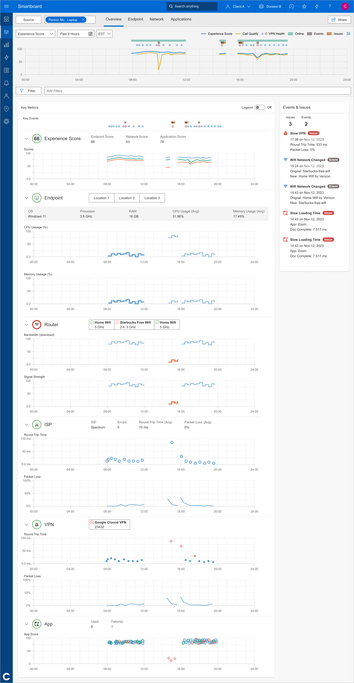
I developed high-fidelity prototypes in Figma with clear annotations for interaction patterns and functionality. As a result of the user interviews and ideation workshop, my team learned that aligning all charts in a single column helps network engineers visually correlate simultaneous issues for faster problem diagnosis.
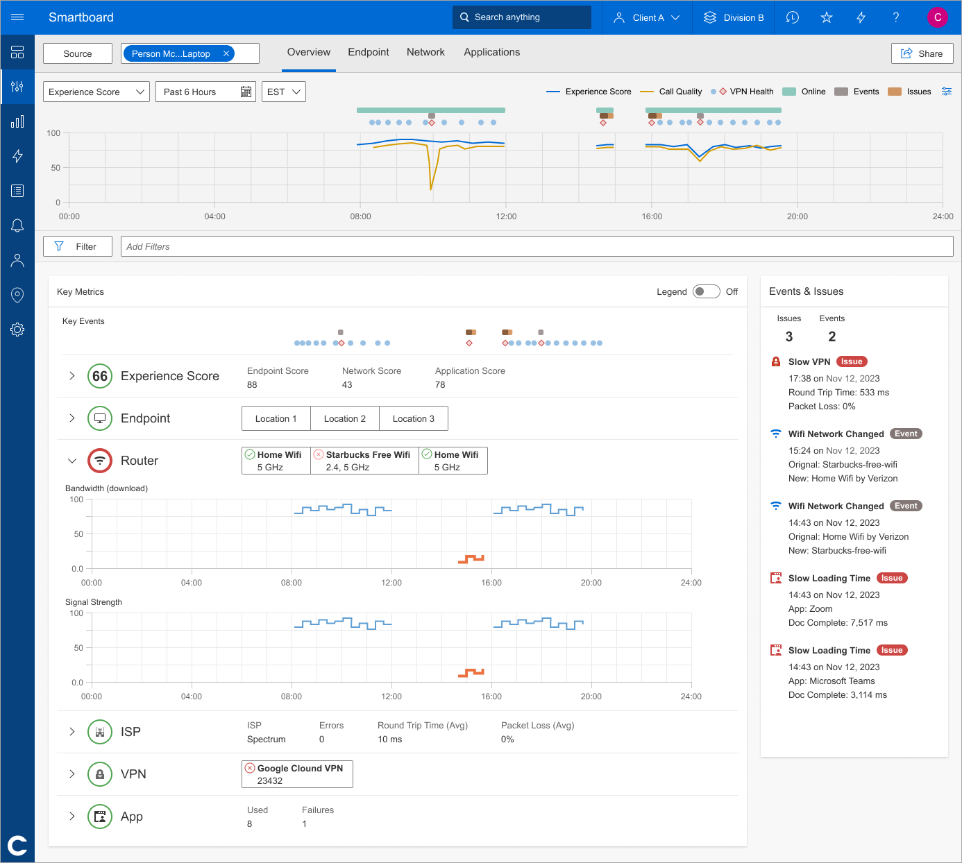
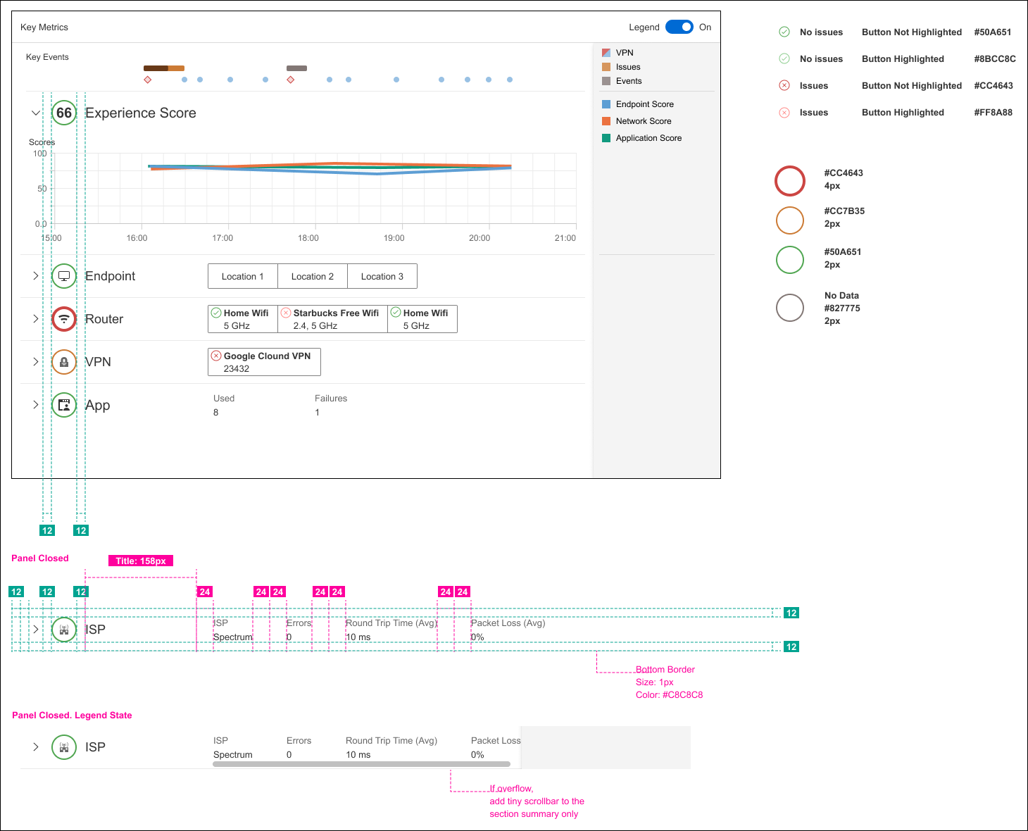
One of the impactful additions was the new Events & Issues Sidebar, which surfaces real-time alerts, like VPN slowness, Wi-Fi changes, and app load issues, without requiring users to dig through metrics. By bringing this information front and center, the redesign helped IT teams resolve issues faster and with greater confidence.
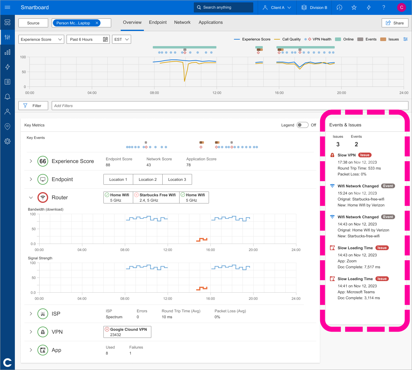
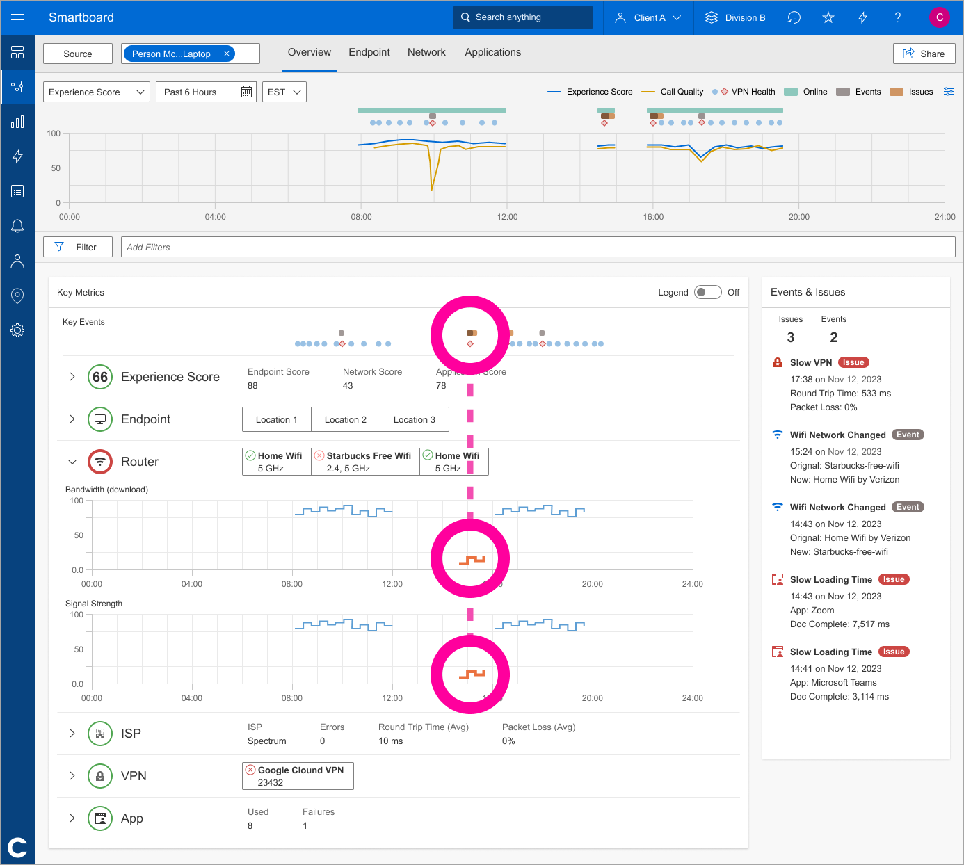
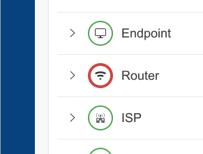
Alongside the Events & Issues sidebar, we also added these visual markers to each network category. A red outline shows you where to focus, no need to guess which panel has the problem. This component became part of our new design system, giving us a way to scale this kind of clarity across the platform.
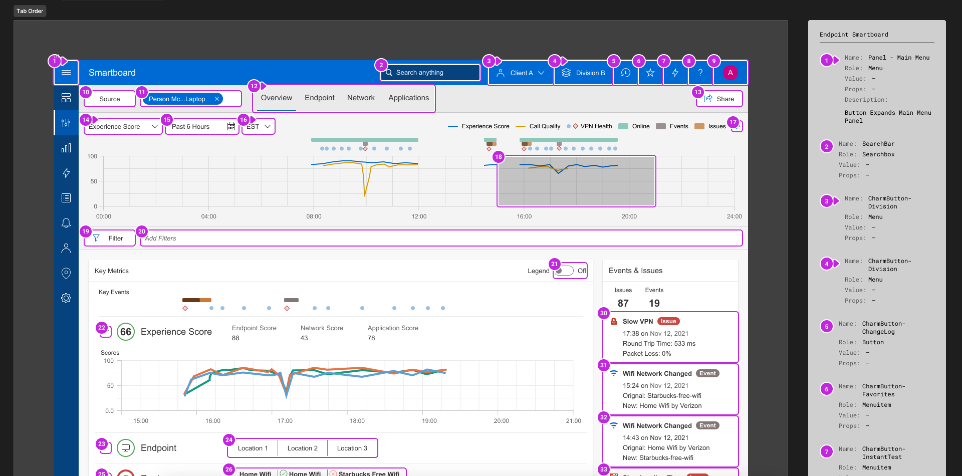
I created interactive prototypes to demonstrate how panels in the Endpoint Smartboard could expand and collapse to improve readability. I then conducted usability testing with end users, using their feedback to refine interactions, enhance clarity, and improve overall usability.
Developer Handoff
Shared final specifications and implementation notes so engineering could build with clear interaction and visual guidance. Final specs were delivered in Figma with detailed annotations focused on reusability and interaction patterns. As part of the developer handoff, I defined the tab stop order, facilitating smoother navigation and enhancing user accessibility.
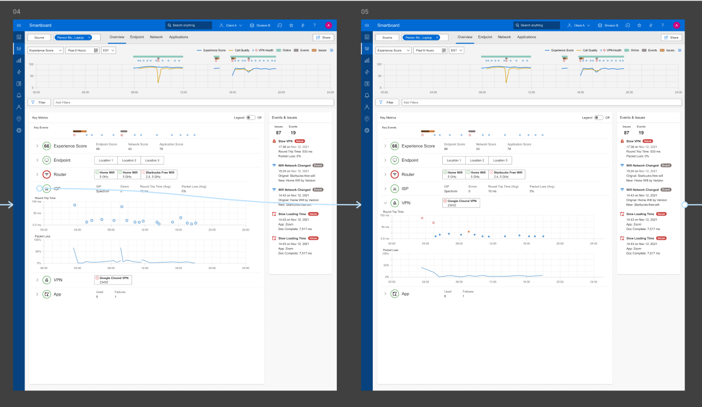
Before & After
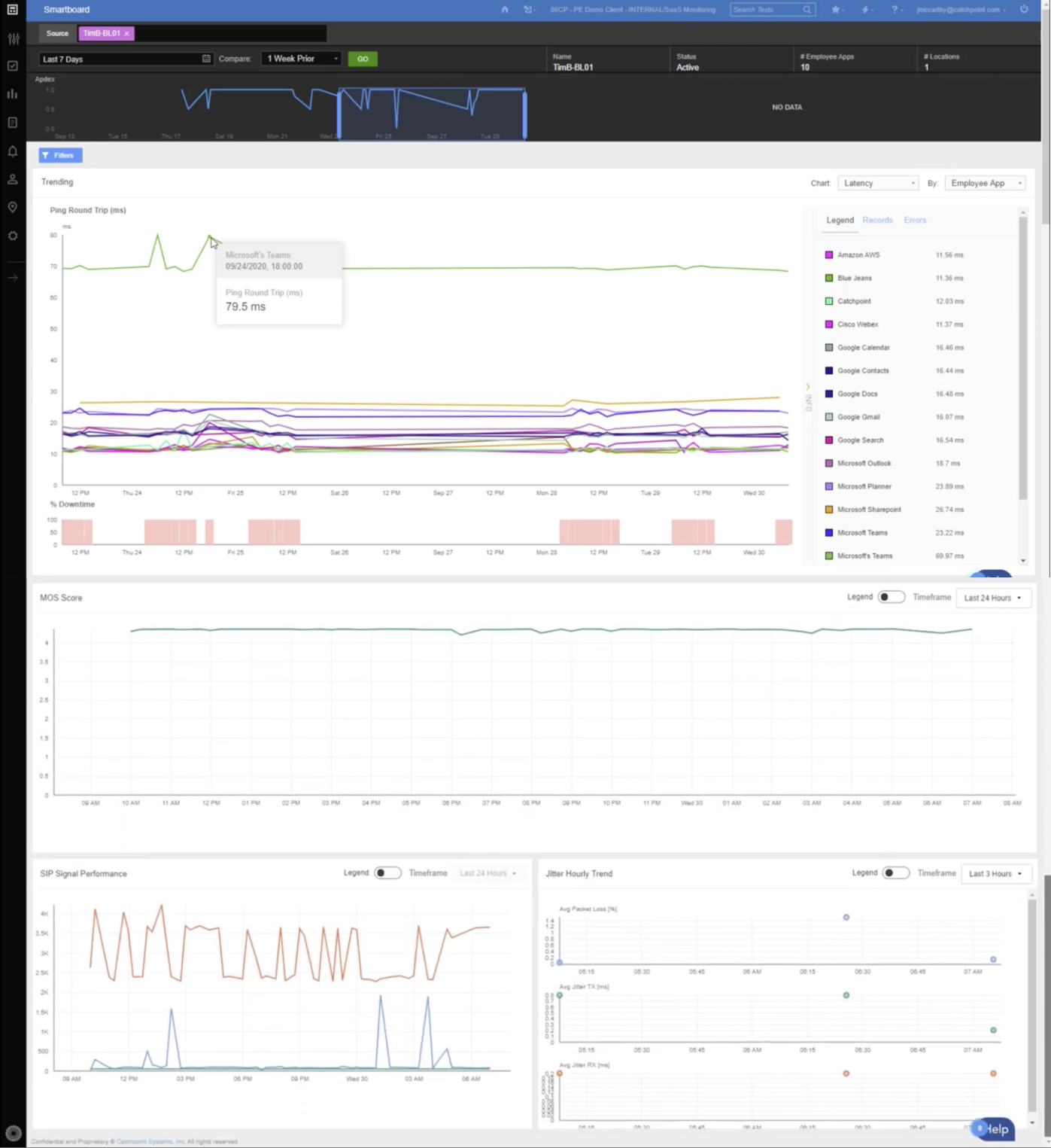
Compared original and redesigned screens to show clearer prioritization, faster issue scanning, and improved consistency.

The Redesigned Endpoint Smartboard Features
- Customizable Dashboards: Tailored views to prioritize metrics relevant to specific user roles.
- Simplified Navigation: Streamlined workflows and an intuitive layout for faster access to critical data.
- Enhanced Data Visualizations: Clear, actionable visual hierarchy for immediate insights.
- Consistent Design: A cohesive and modern interface aligned with Catchpoint's branding.
Outcome
Increased adoption among IT teams, with positive feedback highlighting improved usability and efficiency. Stakeholders praised the design for its clarity, flexibility, and alignment with user needs.
Reflection
This project emphasized the critical role of user research in driving impactful design solutions. By leveraging direct feedback and iterative collaboration, we delivered a tool that not only met but exceeded user and business expectations.